GLP-1 tracker
GLP-1 Medication Levels Chart
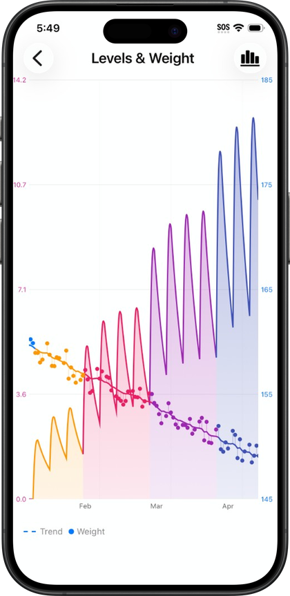
Pokii's medication levels chart estimates how much GLP-1/GIP medication is likely active between your logged doses using published pharmacokinetics—not a blood test. You can switch Combined, Per Medication, and Per Compound views, overlay weight, and add custom drugs with your own half-life and bioavailability on iPhone and iPad.
Quick answer
- What it is: An educational projected concentration curve from your shot history; not lab results and not medical advice.
- Display modes: Combined totals; separate line per medicine; Per Compound (groups brands that share the same molecule, e.g. Mounjaro and Zepbound).
- Multi-drug: Track several active medications; use dose colors and simulated doses on the scheduler to preview schedule changes.
- Weight: Plot weight points, trend, target line, and optional lean mass from Apple Health on the same timeline as doses.
- Off: You can hide the chart entirely in settings if you only want a shot log.
What the projected level chart actually shows
The curve is built from a pharmacokinetic model, not a blood test. Pokii estimates concentration between doses using standard PK math applied to your logged shots, and the app is upfront that this is an educational model, not a lab result. Pokii is a tracking and education tool: it does not provide medical advice, diagnosis, or treatment, and the projected levels it draws are meant to add useful timing context, not to replace real lab work or a conversation with your prescriber.
That estimate starts from what's in Pokii's medication library, which groups branded and compound GLP-1 and GIP entries by their underlying pharmacokinetics, covering entries like Zepbound, Wegovy, Wegovy Pill, Foundayo, Mounjaro, Ozempic, and compounded tirzepatide or semaglutide, among others. For how those entries map to Per Compound grouping, see GLP-1 PK parameters. If you're on something outside that library, you can add a custom medication profile with its own half-life, Tmax, and bioavailability, plus whether it should appear on the level chart at all. The chart itself can be turned off entirely if you'd rather not see it, and it's scroll-limited to the start of your logged journey, so you're not looking at a projected curve for a period before you had any doses on record.
Following a single medication
For most people, the chart starts as a single curve tied to one active medication, and you can add more medications when your regimen needs it. You log each injection with its date, time, dose, and any notes, and the projected curve updates to reflect that history. Because Pokii also has you log a daily check-in with side effects, appetite, and mood, each with relative-to-last hints, you can look at where you are on the curve alongside how you're feeling that day. If appetite is creeping back or a side effect flares, glancing at where that falls relative to your last dose is exactly the kind of timing context the chart is meant to provide.
Pokii is built as a native iOS app for iPhone and iPad rather than a separate web or Android product, and the chart takes advantage of that with pan and pinch-zoom navigation plus a full-screen view that opens a display options menu. On iPad in particular, the extra screen space makes full-screen mode useful for actually studying a curve, whether you're deciding when a next dose should land or just reviewing how the last cycle went. Tooltips can be dragged or snapped along the curve to read an estimated level at a specific point in time, which pairs with the current level summary card on the dashboard using the same underlying math.
Tracking more than one medication at once
Switching medications, or running more than one GLP-1 regimen at overlapping points, isn't unusual in real-world care, and the chart has a display mode for it. Pokii's levels display modes let you view Combined totals, Per Medication curves, or Per Compound curves, where the compound view groups branded medications by the same underlying molecule rather than treating each brand name as unrelated. Seeing multiple curves at once is most relevant once you actually have more than one medication active, when more than one medication is active; the same display modes work whether you have one curve or several.
Once you're tracking multiple medications, Pokii also includes chart coloring by dose or by medicine, plus fully customizable dose colors that carry through to the chart, the widget, and the dose picker, which keeps titration weeks visually distinct instead of blurring together. If you're weighing a schedule change, the shot scheduler adds simulated doses: hypothetical shots you can preview directly on the projected chart before you commit to anything. Simulated doses stay out of the dashboard and widget curves until you actually log the shot or clear the simulation, so a what-if scenario never gets mistaken for a logged dose.
Comparing levels against your weight trend
The same chart can also overlay weight so you're not toggling between two separate views to compare timing against results. Weight check-ins appear as dots plotted directly on the medication timeline, which is available on every plan, and Pokii also includes a smoothed weight trend line with a projected trajectory rather than just raw points. A target weight line is part of the standard chart, letting you see distance from your goal while you're also looking at recent dose history, and Pokii can estimate a goal date based on your trend. Shot markers and medication-change flags sit on the same timeline, so a shift in weight direction is easy to line up against when a dose was logged or when you moved between medications. Pokii can also read lean body mass from Apple Health as a chart overlay, for a fuller picture than weight alone.
If a pattern in the overlay looks worth discussing, like appetite returning around the same point the projected curve dips, or weight trend flattening despite consistent dosing, that's useful information to bring to your prescriber rather than a conclusion to act on alone. For appointments, Pokii's configurable PDF reports can include the projected level curve, weight and target weight, shot history, and related check-in data in whichever sections you select, giving you a static export of exactly the chart context you want to hand over or review together.
Always follow your prescriber’s instructions for GLP-1 medications. Pokii helps you log and visualize your journey; it does not replace professional care.