GLP-1 tracker
Simulated GLP-1 Doses and What-If Planning
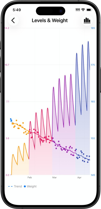
Pokii's simulated dose tool lets you test a hypothetical GLP-1 schedule on the projected-level chart before touching your real history, so a what-if question like moving a shot a few days earlier or later can be tried out visually instead of guessed at. The simulated dose sits alongside the scheduler that already plans real shots, which means testing a scenario and eventually committing to it happen in the same place rather than two disconnected tools.
What a simulated dose is and how it stays separate
A simulated dose is a hypothetical entry added from the shot scheduler: a placeholder shot with a date, medicine, and dose that gets drawn onto the projected-level chart as if it had been logged, without actually being logged. It exists purely to answer a what-if question. Because the shot scheduler lets a next dose be planned with its own projected chart, and preview shots can be added or cleared before anything is committed, a simulated dose can be adjusted or removed as many times as needed while a schedule is being worked out.
The important design detail is that a simulated dose is excluded from the dashboard and widget pharmacokinetic curves until it's logged. That separation is deliberate: the home screen widgets, including the Shot Progress widget and, in Pokii, the Next Shot chart widget, keep showing real logged data, not a hypothetical that's still being tested. The main dashboard chart works the same way. A simulated dose only shows up where it's meant to be evaluated, which is the scheduler's projected chart itself, so exploring several different what-if dates in a row doesn't put any of those hypotheticals in front of anything that's supposed to reflect an actual dosing history. Clearing a simulated dose removes it from that projection entirely, and nothing about it persists into logged data unless the corresponding real shot is actually recorded.
This is built into Pokii; the shot scheduler's dose simulation on the chart is alongside custom medications and other chart tools. Everyone gets the standard projected-level curve and shot scheduling, and you can lay a hypothetical dose on top of that curve without logging it whenever you want to test a scenario.
Scrubbing the chart to compare what-if scenarios
Once a simulated dose is on the chart, the same viewing tools used for the regular projected-level curve apply to it. The chart can be panned across time and pinch-zoomed, and it can be opened full-screen with its own display options menu, which gives more room to compare how a hypothetical dose reshapes the curve over a longer stretch. Dragging or snapping a tooltip along the curve surfaces the estimated level at any point on the line, including the section shaped by the simulated dose, and a per-medication tooltip mode is available when more than one medicine is being tracked. That scrubbing motion is effectively the what-if mechanism: instead of reading a single static projection, moving the tooltip along the curve shows how the modeled level would rise or fall at different points if that hypothetical shot were the real one.
The chart's display modes carry over to a scenario as well. Combined mode shows total levels across everything being tracked with the simulated dose included, Per Medication isolates a single drug's curve, and Per Compound groups branded medicines that share the same underlying molecule. Switching between them while a simulated dose is present can clarify whether a proposed change mostly affects one medicine's curve or the combined total. The dashboard's date-range presets, from a week up to a year, aren't tied specifically to the scheduler, but the same underlying chart rendering means a what-if scenario can be examined at whatever zoom level makes the comparison easiest to read. As always, none of this is a lab measurement. The projected levels are an educational pharmacokinetic model, and a simulated dose only changes what the model draws, not anything about how a medication would actually behave in the body.
Scheduling the real shot once a scenario looks right
Testing a what-if scenario is only half the workflow; the same scheduler that renders the simulated dose is where the real shot eventually gets set. Pokii's flexible shot schedules support a fixed interval or selected weekdays per medicine, with per-weekday dosing, a custom next-shot date, and a reminder time attached to that schedule. Once a simulated dose has shown what a particular date or interval would look like on the curve, that same scheduler is where the entry is turned into an actual planned shot rather than a placeholder, and the chart continues to draw forward from whatever schedule is set.
Because the scheduler and the chart draw from the same underlying data, changing a shot date or interval after committing to it updates the projected curve immediately, so a schedule adjustment can be double-checked against the chart the same way a simulated dose was. Overdue and shot-day banners on the dashboard are also driven by that schedule, appearing when a dose is due or running late, each with a deeplink back into the scheduler to reschedule. That gives the what-if process a natural endpoint: a hypothetical dose gets scrubbed and compared on the chart, a schedule gets set once a scenario is settled on, and from that point forward the dashboard's reminders and banners track the real plan rather than the exploratory one.
Pokii is a tracking and education tool. It does not provide medical advice, diagnosis, or treatment. Talk with your clinician about dosing, side effects, and any change to your plan.