Free tools & guides
GLP-1 Dose Plotter: Projected Levels in Pokii
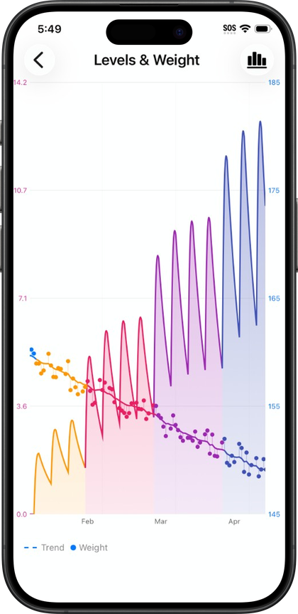
Pokii's dose plotter turns a medication schedule into a visual curve, estimating how a GLP-1 dose builds and tapers between injections using pharmacokinetic modeling for the selected medicine. It's built into the free version of the app and sits at the center of the dashboard and full-screen chart views, giving a rough shape of where levels sit today and where they're headed before the next shot.
What the projected-level chart actually plots
The chart is a pharmacokinetic curve, not a measurement. Pokii models the estimated rise and fall of a medication between logged doses and draws that as a line you can turn on or off, with viewing scrolled back only as far as the start of your tracked journey. Three display modes control how the curve is grouped: Combined shows total levels across everything you're tracking, Per Medication separates each drug you log, and Per Compound groups branded medicines that share the same underlying molecule, such as compounds sold under different brand names. You can pan across time, pinch to zoom, and open the chart full-screen with its own display options menu, and dragging or snapping a tooltip along the curve surfaces the estimated level at any point, with a per-medication tooltip mode available when more than one medicine is on the chart. A current level summary card on the dashboard mirrors that same tooltip math so the number you see there matches what the chart shows. Shot markers and medication-change flags sit along the timeline to mark when doses were logged or when you switched medicines, and weight dots can appear on the same timeline for context.
None of this replaces a lab result. Pokii is a tracking and education tool. It does not provide medical advice, diagnosis, or treatment, and the projected levels on this chart are educational models, not lab results. The curve is a way to visualize a schedule and a pharmacokinetic estimate, not a substitute for bloodwork or a conversation with a prescriber. Custom medications added in Pokii can define their own pharmacokinetic fields, including half-life, Tmax, and bioavailability, along with whether that medicine should appear on the chart at all, which is part of why the modeling can vary from one entry to another.
Simulated doses: previewing a schedule before you log anything
You can add simulated, hypothetical doses to the chart without ever logging a real shot. These preview doses show up on the scheduler and the projected-level chart so you can see how a planned change, like shifting an injection day or testing a different interval, would reshape the curve before committing to it. A simulated dose stays hypothetical until you either clear it or log the actual shot, and Pokii keeps it separate from real data by design: simulated doses are excluded from the dashboard and widget pharmacokinetic curves until they're logged. That separation means a what-if projection you're experimenting with won't quietly bleed into the numbers other parts of the app are showing you, including the home screen widgets. The shot scheduler is where this planning happens, letting you plan a next dose and see its projected chart, then add or clear those preview shots as you refine the plan.
Scheduling the next real injection from the chart
Once a simulated dose looks right, or you already know your next injection date, the same scheduling flow that feeds the chart is where you set the real shot. Pokii supports flexible shot schedules per medicine, so a dose can run on a fixed interval or on selected weekdays, with per-weekday dosing, a custom next-shot date, and its own reminder time. That schedule is what the chart draws forward from, and it's also what drives the overdue and shot-day banners that appear on the dashboard when a dose is due or running late, each with a deeplink back into the scheduler to reschedule. Because the projected curve and the schedule are the same underlying data, adjusting a shot date or interval updates the chart immediately, which is useful for confirming that a new schedule still lines up with how you want levels to look before the next injection actually happens.
Reading the chart alongside check-ins
The projected-level chart is most useful next to the notes you take about how you're actually feeling. Pokii's daily check-in captures optional side effects with an intensity rating per effect, along with appetite, mood, and free-form notes, and it shows relative-to-last hints so you can see how today compares with your previous entry. The dashboard's today's log section pulls check-ins, shots, and other daily entries into one unified timeline for the selected date, which sits alongside the chart rather than replacing it. Because shot markers and medication-change flags are plotted on the same timeline as the projected curve, and the dashboard chart can be viewed across week, month, three-month, six-month, or year ranges, it's possible to scan back and see whether a stretch of logged side effects or appetite changes lined up with a particular point in the modeled curve, such as shortly after a dose or near the point where projected levels were tapering. That comparison is still pattern-spotting rather than diagnosis. The chart shows an educational estimate of medication levels, and the check-in log shows what you reported feeling; looking at both together is a way to notice timing, not to draw medical conclusions.
Always follow your prescriber’s instructions for GLP-1 medications. Pokii helps you log and visualize your journey; it does not replace professional care.