Free tools & guides
Weight Loss Timeline with Pokii Charts
A weight-loss timeline is more than a line going down. Pokii builds yours from the shots you log, the weight check-ins you enter, and the photos you choose to keep, then lays them over each other on the same chart so you can see how they relate week to week, on your own device.
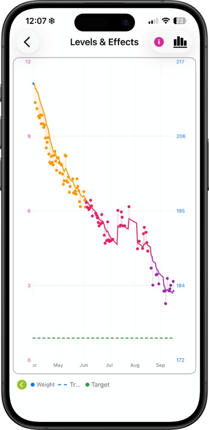
Weight next to your medication-level curve
Pokii's home chart plots weight dots directly on your medication timeline, so a weight entry sits in the same view as your projected medication level curve. The level curve itself is an educational model of how a GLP-1 or GIP medication rises and falls between doses, not a lab result, and it can be turned off if you'd rather look at weight alone. Shot markers and medication-change flags sit on that same timeline, so if you switch medicines, change doses, or fall behind on a shot, you can see it next to the weight trend rather than trying to remember the dates separately.
You can switch the medication curve between combined, per-medication, and per-compound display modes, which matters if you've changed brands or track more than one active medicine. Chart tooltips snap or drag along the curve so you can check the level and weight reading for a specific day, and the chart supports pan, zoom, and a full-screen view with its own display options. Date range presets for week, month, 3 months, 6 months, and year let you zoom out from a single titration week to the full stretch of your program. a smoothed weight trend line and projected trajectory ride alongside the raw weight dots, and a target weight line with an estimated goal date is available for anyone with a goal weight set. Pokii also includes a lean body mass overlay, read from Apple Health, for a second data layer beyond the scale number.
None of this is meant to explain why a titration week behaves the way it does in general. It's meant to put your own dose changes and your own weight entries on the same axis, so patterns in your own data are easier to notice.
Progress photos alongside the numbers
Numbers on a chart don't always match how a week felt, which is why Pokii keeps progress photos in the same journey as your weight. The My Journey hub brings together weight, BMI context, days on program, progress photos, and body measurement entry points in one place, and the Calendar tab shows shots, check-ins, photos, weight, and body measurements together in month or list view so you can tap any day and see what was logged.
Progress photos appear in a dated carousel with weight context attached, so a photo from early in your timeline sits next to the weight reading from around that time. you can capture new progress photos over time. Body measurements for waist, hips, chest, neck, arm, thigh, and ankle track alongside weight too, with their own history, for the weeks when the scale and the tape measure tell slightly different stories. Photos are stored in iCloud Drive, and the rest of your structured data, including weight and shot history, syncs through your personal iCloud account, so the timeline stays tied to your Apple account rather than a public profile. You can also generate a configurable PDF progress report that pulls from this same data, choosing which sections to include—such as weight, target weight, shots, body measurements, and more—useful for sharing a snapshot with a provider.
A timeline that's yours, not a comparison
Pokii has no ads and no public social feed, so nothing about your weight timeline is built for other people to browse or compare against. There's no leaderboard version of your chart and no feed of other users' numbers to measure your week against. The medication level curve on your chart is explicitly an educational model, not a lab result, and Pokii is a tracking and education tool rather than a source of medical advice, which is a useful frame for the whole timeline: it's a record of what happened to you, plotted against what you logged, not a prediction of what should happen based on someone else's story.
That framing is also why the chart leans on your own history so heavily. Weight dots, the medication level curve, shot markers, medication-change flags, and the trend and projection lines available in Pokii are all derived from entries you made, viewable across whatever date range you choose. Photos and measurements sit next to that same timeline in My Journey and on the Calendar tab, adding context without turning any of it into a public comparison. Whether you're a few weeks into a first medication or well into adjusting doses, the timeline is built to reflect your own week-by-week pattern, on your device, synced privately to your iCloud account.
Always follow your prescriber’s instructions for GLP-1 medications. Pokii helps you log and visualize your journey; it does not replace professional care.